Let me tell you a story, dear readers. A story of one of the only projects I really enjoyed doing at Central Saint Martins. Well, "enjoyed" might be too strong of a word.
This project had a prompt as lackluster as porridge: "what is your journey?" I was feeling particularly lonely that term and so I planned to do the project on physical journeys, historic journeys, epic stories and poems, migration, the hero cycle, and my own journey from San Francisco to London. After I had amassed a pile of research several hundred images thick I approached my Evil Tutor with my idea, only to have him cut me off with a disappointed sigh and the question, "why don't you do it on fashion or something more interesting?"
At that point I realized he wasn't going to like anything I produced, so I whittled the grand concept down to something so basic even a luddite like Evil Tutor could grasp it. But I had to keep in mind the fact that this was Saint Martins, and they don't like anything too direct or obvious. So, first I narrowed the concept to something physical: two iconic bridges. One from the city I came from, and one from the city I came to. And then to make it more Saint Martins-y I decided to focus not on the bridges, so much as the way they cut up space... the negative space around the bridges. (This is when my fascination with negative space began.)
The project was called "The Spaces In Between", and now I'm going to share it with you.
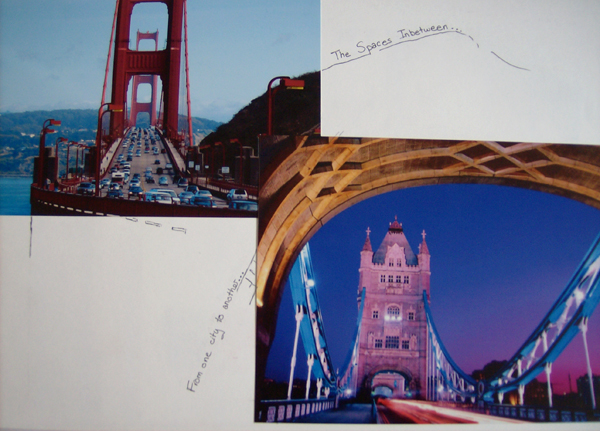
From these sketches of negative space I began to wonder what defined space as negative. If you are looking at the space around an object at the same time as you are looking at the object itself, you are seeing the same thing two different ways at the same time. So my next step was to find a way to visually explain the idea of "looking at the same thing from two angles at once" visually to my Tutor.
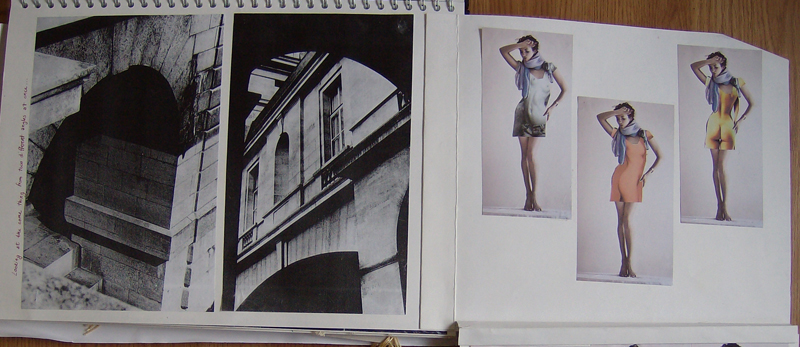
I found a photographer whose name escapes me now, who photographed the same arch from two perspectives and placed them one right next to another. How would that translate to fashion? I imagined a woman wearing a dress with a naked body printed on it that was facing a direction other than the one the wearer was actually facing.
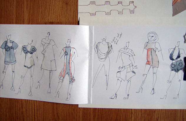
But Saint Martins likes to see that you always refer back to your original concept by the time you design rough sketches. So after some playing with 3d application of this concept on top of this my naked torso ideas (again, which didn't photograph well), I designed a number of very strange garments.
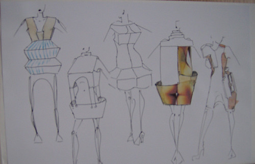
Now, before you think, "holy shit, those are some crap drawings and hideous designs," let me explain that I went a bit crazy with this project because my tutor told me two conflicting things at once shortly before I began this project. First he told me that I didn't experiment with shape or concept enough, and then he told me not two minutes later that my designs were too outlandish and not at all wearable. So I tried to both experiment with shape, but not go as overboard as I previously had.
Moving on....
That same photographer also played with space by taking photos of an archway, cutting it in half and thereby redefining the space it occupied. It was a natural progression from my last idea, so I started cutting up the body and redefining the space it would take up. I then took something very basic- the jeans and t shirt- and cut those iconic shapes up, changing the space and shape they used.

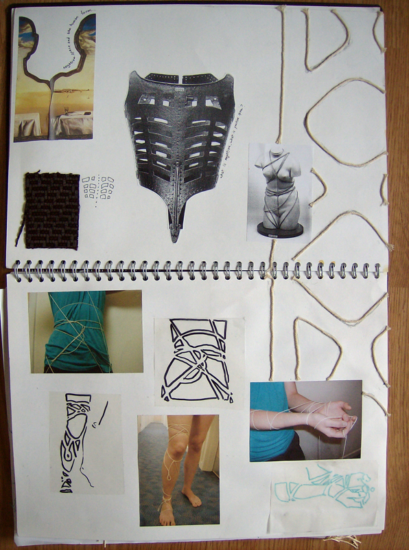
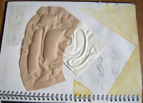
I liked the idea of playing with familiar shapes on the body, so I asked one of my flatmates to let me tie her up. Using string I created some interesting shapes on her body, around her body, and then translated these shapes into negative and positive space, before changing the negative into positive again etc etc. I ended up using some of the shapes created by the string and raising them by quilting a fabric sample...
I also looked at artists who responded to the shape of the body in unusual ways, and found that I was drawn to things that protruded from the body in unusual ways, so I did a few fabric samples to create little nubbins that would protrude from seams...
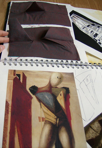
But I worried I had strayed too far from my original starting point and Evil Tutor hated my train of thought, so I explored the use of space again by literally taking the images I began with and cutting them up, sewing the paper back together, etc in order to create new shapes out of them.

Which I then combined with the idea of quilting shapes (thereby turning a flat space into a 3d space) and designed a few more roughs:
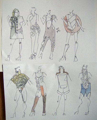
So now I had a lot of ideas, but I had more to do. Being a fashion and print student, I also had to design and produce a print for my fabric.
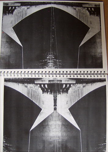
I once again went back to my original bridges and my idea of negative space and began looking for art and photography that served to illustrate my ideas. In the end I ended up tracing out the negative space around the bridge in the black and white photo on the top page. I then repeated that pattern, cut out out and made a ghetto screen which I used to print, foil, flock, and dye fabric with. (The print looked like what you see on that sheet of tracing paper stuck in the book.)
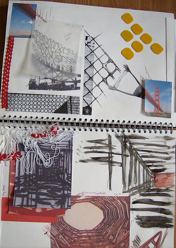
I then proceeded to combine all these concepts together to create a booklet of about 15 fabric samples using my new print, some of my original concepts, and all the various artists I ended up looking at. Here are a few poorly photographed samples:
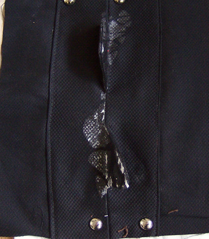
Nubbins, a clear foil print, and industrial looking seams/bolts. Very bridge like and also very in line with what I wanted to do. Pardon the brown fuzz on the fabric sample. heh.

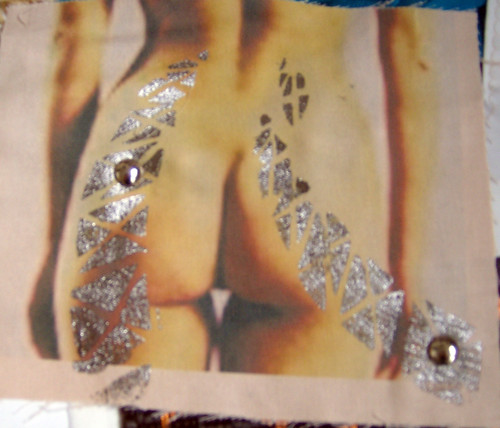
The ass print from the original "looking at the same thing from two angles" idea, combined with the bolts, and the print, done in foil.
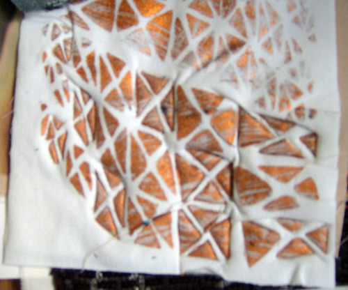
Just the print, quilted in select places. Um, I did this one very quickly so please excuse the mess. It was just a quick sample, remember.
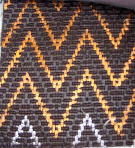
Taking the concept of the bridge print and making it less literal.
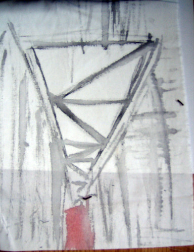
A painting using the artist I found late in the project that I felt showed the softer side of the steel structures.
Now, using these and my other ten samples, I did a few more sketches recycling my favorite styles from the previous sketches and applying my new prints onto them:

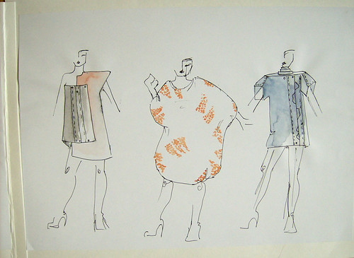
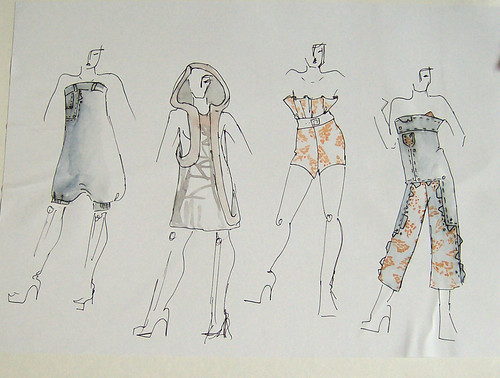
And finally, I attempted to change the very fashiony way I illustrate (being trained for 3 years in fashion illustration will do that) to reflect the playful nature of the designs I settled on. These were a lot of fun to do:
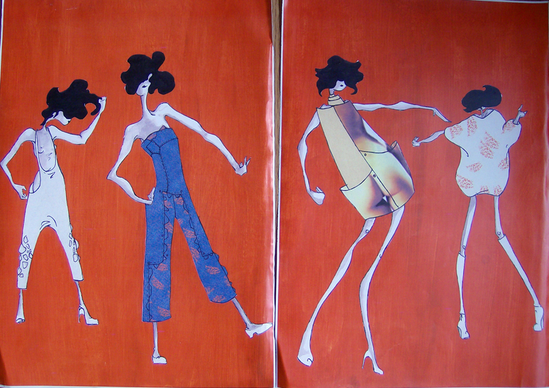
I think my favorite is the ass dress, which I aim to produce at some point...
So that's a rough idea of how a project went for me. I got a lot of good response from my classmates on this one. And although it was a very new way of working, and I had to disregard all the research I did in the beginning, I felt like I arrived at something that I could see being worn.
I also realized that the project could have been much more Me. It would have been more interesting, more in-depth, just "more" if I hadn't had to waste time visually explaining my ideas to the tutor, instead of just working the ideas through to their logical and creative end. I was too tutor-aware my boyfriend said, and he's right. This project would have been much more interesting if Evil Tutor didn't need each step explained out to him. He could never follow my thought processes and so I went to a great deal of trouble trying to visually explain them to him which in the end distracted me and stunted my design process.
Of course I failed this project. Evil Tutor never told me why, and frankly I didn't care. Shortly after this project I realized I didn't want to be at Saint Martins anymore.
Funny how a project about journeys would end up pointing me in a new direction.


5 comments:
This was fascinating and inspiring! I loved watching your progress and hope you post more of these types of journeys.
I never learned any 'design' in school per se, just the technical side so I had no idea how to get inspired like this.
That was a really interesting description of your process for this. The final images are really charming. I hope you do make the ass dress.
Thank you, ladies. :)
I am trying to come up with a new project right now, and I'll document the process as it goes. :)
I almost hate the evil tutor more than I've ever hated anyone, unless he did it ALL on purpose to inspire you to not listen to some crap-spewing tutor wannabe and to really, deeply follow your own process. In that case, I love the evil tutor. Well, not love, but.... Okay it reminds me of the role of the "petty tyrant" in Castenada's work.
The ass dress is a fantastic idea and vision, how about some arse underwear, personalised arse underwear as a gift?
Post a Comment