I have a portfolio due on Wednesday, and so I've had to suck it up and take photos of all the work I've been dreading looking at. Going back over my work I can see now how poor the quality of work really is, but I can't quite figure out how to make it better. I can see why I failed. And failed. And failed. And failed. I found that staring at my work en mass was incredibly depressing and as a result I have barely done any work on my portfolio. I still don't know what the hell I'm going to put in there.
But I have had to take a few photos of my garments. Since I have them, I might as well share. More are forthcoming.
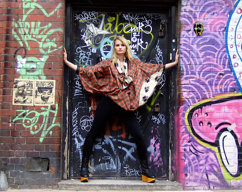
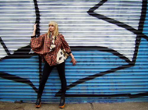
The Shirt Project: I chose to design with Vivienne Westwood in mind, drawing inspiration from the 90's attitude of apathy, and layered look of eastern European nomadic tribes.


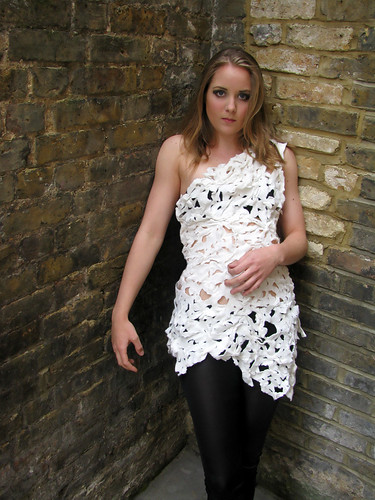
The White Project: We could use only white felt or cotton to make our garment. While I HATED the other two pieces I made, the amount of time and effort I put into delicately shredding and hand-gathering this felt top stopped me from throwing it out like the rest of the project. Pared with black leggings, a pretty blonde, and a brick wall, it doesn't look too bad, I suppose.


The Accessory Project: The goal of this project was to try our hands at various printing techniques. I tried as many as I could at the time, but opted for a simple, elegant velvet devore of two bird wings.

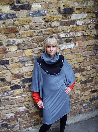
The Retrieval Project: This was the "Congratulations you failed!" project that I was forced to do at the same time as all my other work last term. As a result of the time pressure, the garment was thrown together in one day, and has nothing fancy or insane on it. Except for the fact that the red sleeves are in fact long enough to touch the ground. It was inspired by deep sea creatures and by the vintage diving helmets.

The Metamorphosis Project: This was the team project that went to hell. I ADORED working with my team mate. She and I want to work together again. We started our project by sketching things at the Darwin exhibition, and focused on the ideas evolution, natural selection, and protection. We ended up designing two clashing prints- hers was a blocky, graphic print in two tones that felt like a tribal print of muscle fibers and cells. Mine was a print of black hair on a skin-toned fabric used to cover an exoskeleton that was to be worn over her muscle dress. It wasn't meant to be beautiful or wearable, just interesting and conceptual.
(Please pardon the shitty photo, we had to take it indoors in a poorly lit hallway due to rain.)

Ok, that's it for now.


1 comment:
Looks like something I might wear.
Really, I quite like it! I would sum up by saying, I think you have some serious, kick-ass potential. :)
Post a Comment